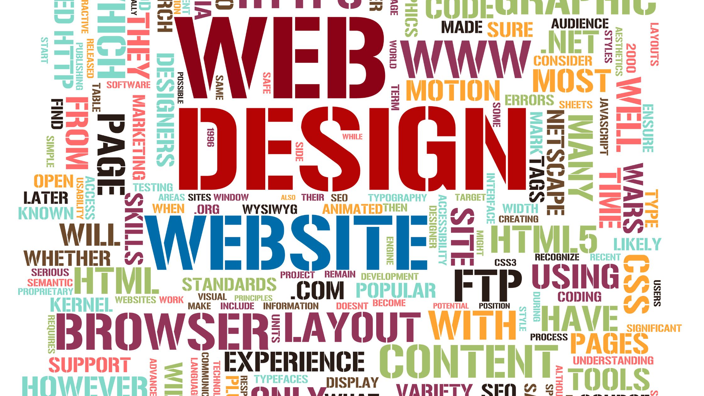
Website design has undergone remarkable changes over the years, transforming from simple HTML pages to dynamic, interactive, and mobile-friendly experiences. As the internet continues to evolve, so too does the approach to creating visually appealing and user-friendly websites. In this blog, we’ll explore the evolution of website design, the key lessons learned along the way, and how businesses can leverage these insights to create compelling websites that meet modern user expectations.
The Early Days of Website Design
In the early days of the internet, website design was incredibly basic. Websites were primarily composed of static pages with little to no interactivity. The focus was on functionality rather than aesthetics. Early web designers used simple HTML (HyperText Markup Language) to create websites, and navigation was limited to basic text links.
While websites were functional, they lacked the polish and user experience (UX) that modern websites offer today. The design landscape was dominated by text-heavy pages, static images, and minimal use of colors and fonts. There was little consideration for mobile responsiveness, as most people accessed the internet through desktop computers.
The Rise of Flash and Multimedia
As the internet grew, so did the demand for more dynamic and engaging websites. In the late 1990s and early 2000s, Adobe Flash became a popular tool for creating animated graphics, videos, and interactive elements. Web designers could create websites with vibrant multimedia, allowing for more creative freedom.
While Flash offered exciting new possibilities, it also introduced challenges. Websites built with Flash were often slow to load, and search engines struggled to index Flash content effectively. Additionally, Flash was not compatible with many mobile devices, leading to a poor user experience for mobile users. These issues became more apparent as the internet matured and user expectations grew.
The Emergence of Web Standards and CSS
By the mid-2000s, web designers began to focus on improving website performance and accessibility. This was when web standards like HTML5 and CSS (Cascading Style Sheets) gained prominence. Web standards provided a framework for creating websites that were not only functional but also visually appealing and accessible to a wider audience.
CSS allowed designers to separate content from presentation, making it easier to create consistent layouts and styles across multiple pages. This era saw a shift toward cleaner, more structured designs with a focus on usability and user experience. As websites became more interactive, web designers began incorporating JavaScript to add dynamic elements like dropdown menus, image sliders, and interactive forms.
The Mobile Revolution and Responsive Web Design
The next major shift in the evolution of website design came with the rise of mobile devices. With smartphones and tablets becoming ubiquitous, designers realized that websites needed to be optimized for smaller screens. This marked the beginning of the responsive web design movement.
Responsive web design (RWD) allows websites to adapt seamlessly to different screen sizes, ensuring that users have a consistent experience whether they are browsing on a desktop, tablet, or smartphone. This shift was essential as mobile internet usage surpassed desktop usage, and businesses had to cater to mobile-first users.
Lessons Learned from the Evolution of Website Design
As the internet and technology continue to evolve, web designers have learned several key lessons that influence modern website design practices. Here are some of the most important lessons:
1. User Experience (UX) is Key
One of the most significant lessons from the evolution of website design is the importance of user experience. Websites are no longer just about presenting information; they are about creating engaging, intuitive experiences that guide users toward their goals. Whether it’s making a purchase, filling out a form, or finding information, the user’s journey should be smooth and enjoyable.
2. Speed Matters
Over the years, the demand for faster websites has grown. Slow-loading websites can frustrate users and lead to higher bounce rates. Web designers have learned the importance of optimizing images, minimizing code, and leveraging caching to ensure that websites load quickly and efficiently.
3. Mobile-First Design
With mobile devices now accounting for a significant portion of internet traffic, mobile-first design has become a necessity. Websites must be designed with mobile users in mind from the start. This means using responsive design, optimizing content for smaller screens, and ensuring that touch interactions are smooth.
4. SEO and Web Design Go Hand-in-Hand
The evolution of website design has also been closely tied to search engine optimization (SEO). Websites need to be designed not only to be visually appealing but also to be easily indexed by search engines. This means following best practices like optimizing meta tags, using semantic HTML, and ensuring fast page load times.
5. Simplicity is the Ultimate Sophistication
As design trends evolve, one thing remains constant: simplicity. Over the years, websites have moved away from cluttered layouts and excessive design elements. Today, minimalism is a key trend, with clean layouts, ample white space, and easy-to-read typography.
6. Designing for Accessibility
As awareness of accessibility issues grows, designers are paying more attention to making websites inclusive for all users, including those with disabilities. This means ensuring that websites are navigable with screen readers, using high-contrast color schemes for readability, and providing alternative text for images.
The Future of Website Design
Looking ahead, the evolution of website design will likely be shaped by emerging technologies such as artificial intelligence (AI), virtual reality (VR), and voice search. AI-powered design tools will make it easier to create personalized, dynamic websites, while VR and augmented reality (AR) could create immersive, interactive web experiences. Voice search optimization will also become crucial as more users rely on voice assistants like Siri and Alexa to browse the web.
Conclusion
The evolution of website design has been a journey marked by innovation, challenges, and valuable lessons. From the early days of static pages to the responsive, user-centric designs of today, web design has come a long way. By understanding the key lessons learned from the past, businesses can create websites that not only look great but also deliver exceptional user experiences.
As we continue to embrace new technologies and design trends, one thing remains clear: the future of website design is all about creating seamless, personalized, and accessible experiences that cater to the needs of users across all devices.
f you’re looking to create a modern, responsive, and user-friendly website that stands out, CubiKode Agency is here to help! Our team of expert designers and developers will ensure your website not only looks great but also performs seamlessly across all devices.
Reach out to us today for Website Design and Development services:
Phone Numbers:
Call Us: +254 719 235 165
WhatsApp: +254 719 235 165
Email Address:
info@cubikode.com
contact@cubikode.com Let’s bring your vision to life and take your online presence to the next level!